
Photo by Deeksha Pahariya on Unsplash
Building an instagram profile clone with html and css
A project that emphasizes on thought process when designing pages with html and css.
So for my weekend i decided to do something fun and "work related", not exactly work related cause my every day job is me building APIs, optimizing them, implementing some system design so basically it's me being a backend developer learning and building while learning. So my project for the weekend is an instagram profile page, and it's a profile clone of one of my fav celeb (Dj cuppy).
My inspiration for this is thanks to a challenge i was part of a year ago. It was a challenge by one of my mentors (ebenezer Don) who shared a video on "modularization in vanilla js". It's basically us splitting a project to components (re-usable components), just like what we have in frontend frameworks/libraries (react.js, vue, angular, e.t.c), you can check his video on youtube, nice stuff.
Lastly, not just that, i'm also blogging this to maybe help a newbie get a hold on html and css. i'm not experienced (top tier) nor am i a frontend developer (you might wondering how i'm going to explain the css part lol), well before engaging full time to backend development, i started as a newbie in frontend (and a big fan to css), and most people will say the frontend part of web development is the best way to get started, tho now being complex these days, the basics of it still worths learning. So let's get started.
This image below will be what we'll be building and it's a screenshot of what we used then for the challenge, and we will break down what's needed first before writing codes.
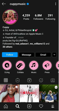
So before we get started, First thing’s first is to create a process for us to follow, I mean we don’t just jump straight to coding with vsCode, atom, sublime, e.t.c, an analogy we can use is an engineer building a project, he/she doesn’t just jump into merging metals (or whatever they do, lol). The engineer needs to write some calculations, make some hypothesis, check for science laws, e.t.c before jumping straight to building. Same for us In building this with html and css. Html and css may seem too basic to some people, I mean people always think you brainstorm for stuff that appear hardcore (Algorithms, e.t.c), truth is everything needs some brainstorming no matter it’s level of difficulty, it saves time and keeps our sanity in check. (even writing this articles does too, lol).
So creating a process to designing this will be for us to visualize our design in boxes. Strange but it helps, and I’ll explain why (reference to html and css ofcourse).
Html has what we call a “div”, a div is basically what helps us arrange related stuffs in our content, people do call it “division” and for some reason it makes sense. A div in this case is like a section or a piece of a whole UI, which we can move around and arrange to our taste (think of them as pixels in those cube games, i dont know what they are called).
Then for the css part, I personally always think “LAYOUT” first. Layout in my case, just means the arrangement of those divs in the html. Take a brick game as an example, a div is a brick containing related contents together, and my idea of a layout in css means to arrange those pieces of bricks in a design we want. (Hope I tried?)
And note this is a very very basic way of doing this, real production situations will probably be more than what we did here. So at the end of the breakdown, i came up with this
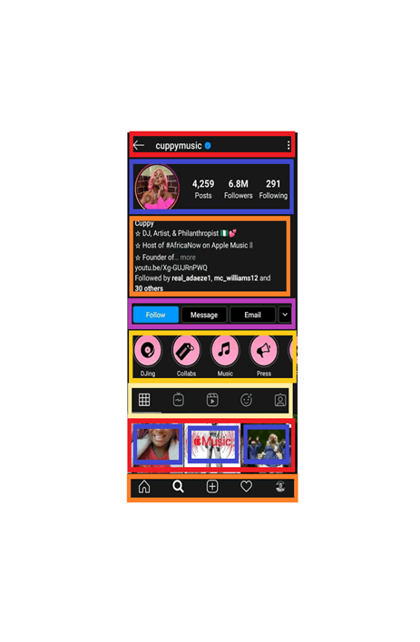
So we can see from the image above, each of the boxes with colors represent a “div” and are all arranged with a style (Layout). An example is the Header with the username, it is a straight forward design, we already know the header is a div, now we’ll just decide on the inner divs to create if there’ll be any and for the Layout, we’ll just design those inner divs in the header to move horizontally and for this, modern css flexbox will easily help within seconds (me thinking out loud), you can see without even writing codes with a text editor, we are already writing codes with our minds.
So now we’ve broken things down, ladies and gent shall we ? First thing first which is very obvious will be to open our editor with a html file (typical index.html), and a css file (again index.css), then a folder to hold static files like images, icons and e.t.c. Here is mine
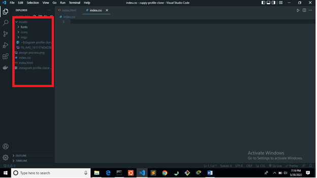 And these name (index.html, index.css) can be anything test.html, e.t.c whatever you wish to name them.
So lets start with the html. Recall we already have a breakdown of steps to follow, and the very most basic way to write the html will be as what we’ve designed, i.e using boxes and in html, it’s what we call "divs".
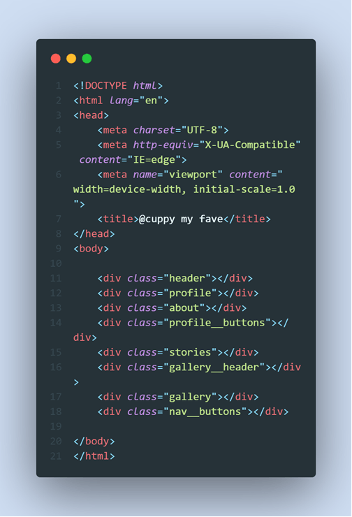
So what’s next will be the “divs” as that will be in these divs. I mean for the headers as well, we (actually me) can see two inner divs here, you might see 3, it all makes sense… I’m seeing 2 divs coz as I write my html with an image of the design, I simultaneously think of my css styles and how easy i can make it work for me. Everybody has what works for them and it's not bad if you get stuck at this, thats part of growth, just keep practicing.
Here’s how I’ll design my css for both methods. First if there’ll be 2 divs, i.e the “left icon”, username and verified icon in one div and the hamburger menu in another div. I can simply just use the css display flex, align items to center vertically, and justify items of “space-between” with the headers div set to a width I can control. Then I’ll just design the first div based on widths, might even make that width have a display flex too and it’ll work.
or, If it’s for 3 divs, one will be for the left icon, one for the username and the verified icon, while the last for the hamburger menu icon. Use the display flex, align items to center, and there’ll be no point in using the justify items in css, so I’ll just manage widths among the 3 divs. Again, this will work.
Both works, but now there’s something called responsive design, where your design have to fit atleast 2 to 3 screens without much “manipulations”. CSS already have these cool functions that helps design with sizes, widths, e.t.c across widths of devices. So I’ll just better use those and for that I’ll prefer the first option, I’ll be taking advantage of flex i.e justify items to manage spacing while limiting my widths to some amounts/percentages other than desigining width for each inner div and also for the outer div. Again, these are basics and i'm trying to avoid doing too much, with the second option, you can still use flex even in making it responsive with the "flex" property. something like
flex : 1
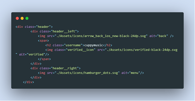
So now lets write the css and you might be thinking on what the span is used for, the “span” is also like a div too but in it’s case, it separates contents just like div but arranges them horizontally. normally by default if you create 2 divs or a div after a content or before a content, it’ll render it like someone standing straight (the head, the stomach, the legs, i.e vertically ) but with “spans”, it makes it look like the 2 eyes of the head (horizontal arrangement).
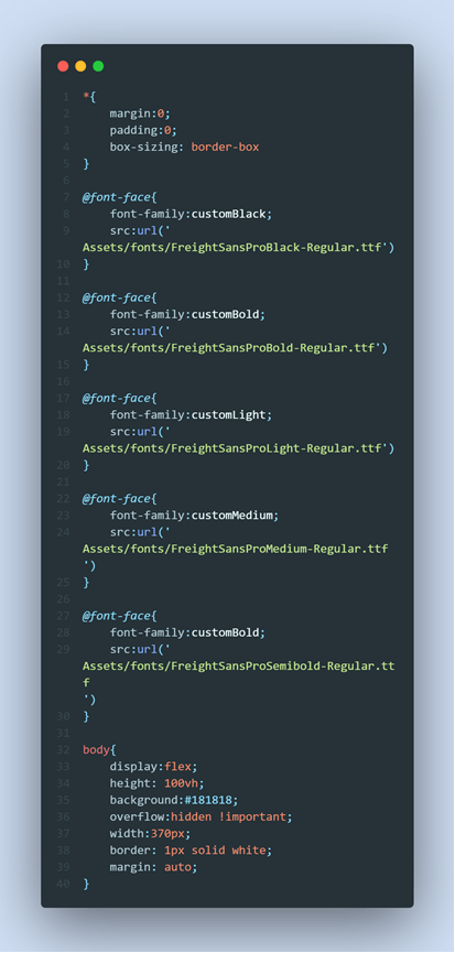
So we’ve started off our css by respecting tradition lol, line 1 to line 5 is like something most of us love doing, it helps tho (it's just to help in resetting the default style by the browser to nothing). So these css codes are just to import a font file we’ll be using, help set up the background of the body and also designing a mobile phone while on desktop, because we are not designing this to be responsive for desktops and large screens, just a mobile view design.
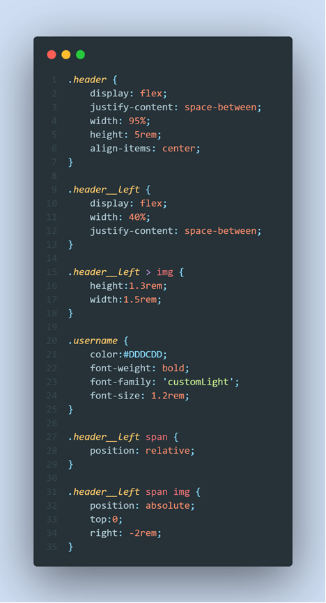 That’s our css code for the header. Exactly what I had in mind, and here’s the result.
 Thanks to how I took the screenshot, the width looks uneven. But hopefully in your screen, it’ll be running perfect.
So what else? From our design, we switch to the next portion, the profle. So the profile will just be her image, then her followers statistic, e.t.c. So just like the last last time, we'll think about the css too even as we write the html codes. We can start by making 2 inner divs, one for the image, while the other to contain those counts. And within the second div, we’ll be making 3 divs for each statistic she has on followers, e.t.c
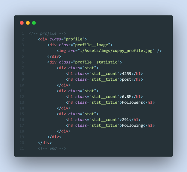 and the css
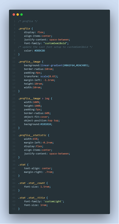
while the result will be
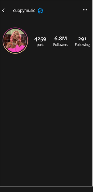
One part I so much love in this design is the profile picture, and just as it seems somehow difficult to implement, it is very easy. The design was just done with basic logic, first we had to create a div to hold the pic with the class name, profile__image, then we add that instagram color combo to it with the linear gradient for mixing colors. Now the image is lapped on the div, and the div has some colors to it, this means the image will look as if it has the gradient color as it’s background color, but that is just for the div. So what we do is add a background color to blend with the background of the app. We can make it transparent as well with css transparent property, but lets chill with basics. And the rest will be on the border radius for the round shape and padding to give the image some space in the div. That is we'll be saying body --> div --> picture. div has the linear gradient as background, while the picture itself has a background color of the main body. You can use the transparent property for this too.
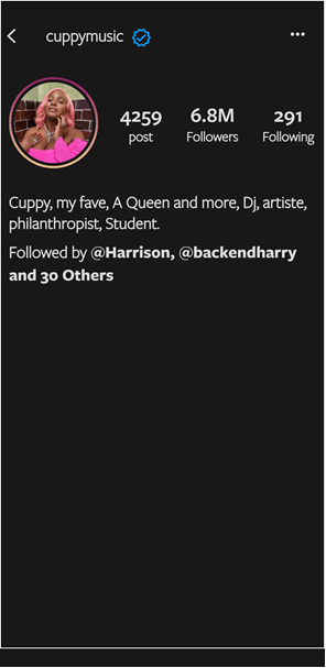
So our next mission will be on her “about profile”. This wouldn't need much explanation cause it is self explained.
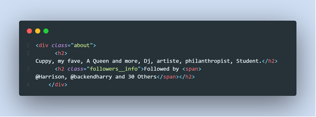
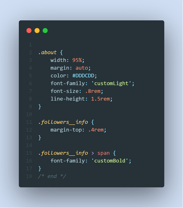
and the result is
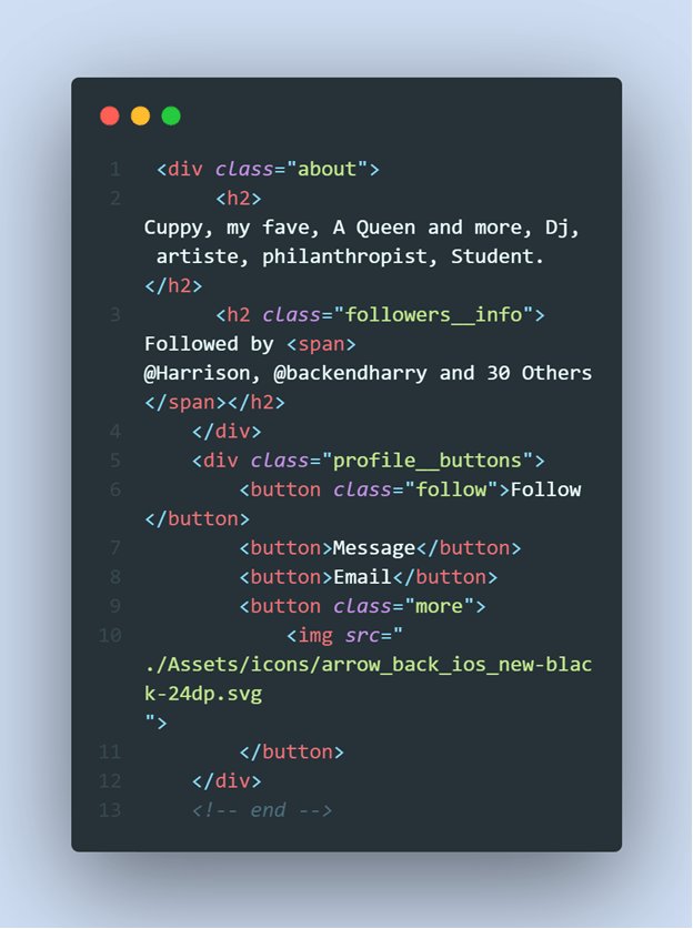
Next will be the “follow button”, “message button”, “email”, e.t.c The html and css.
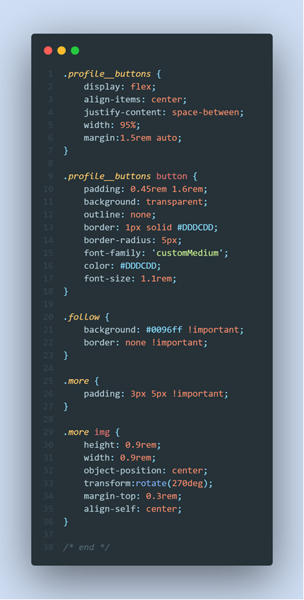
and the css too
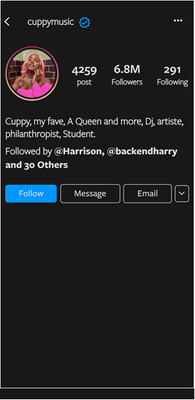
with the result to be
we also designed the scrollable stories too and also made it look nearly identical as if it was views on a mobile device.
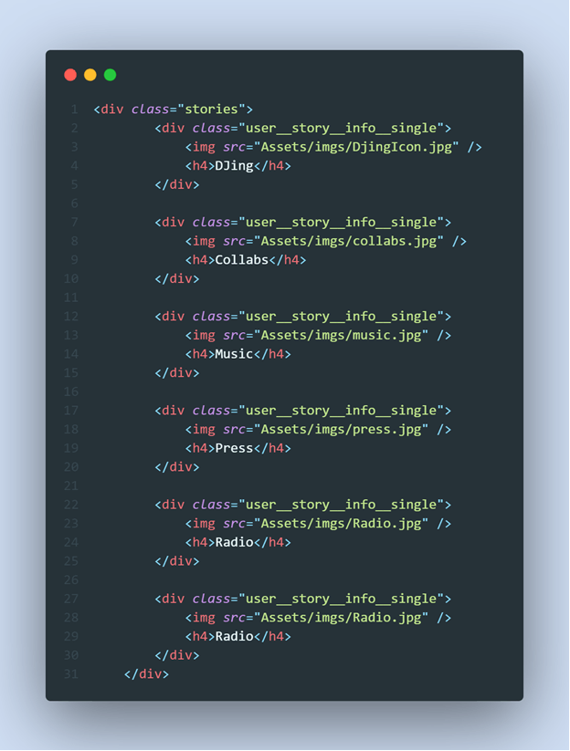
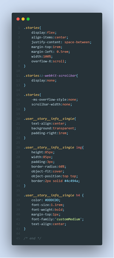
and the result
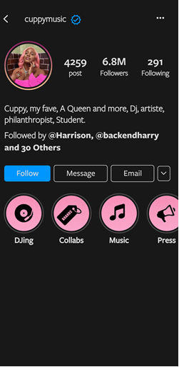
Next will be the gallery header section ….
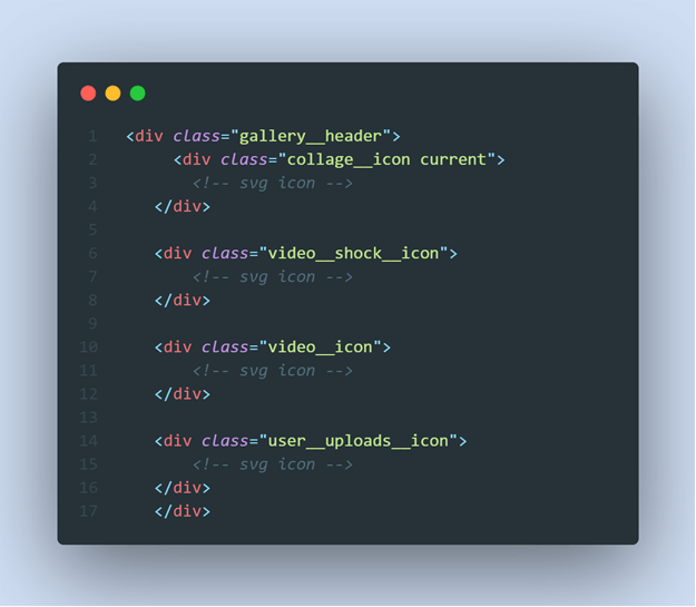
and the css to the html code will be
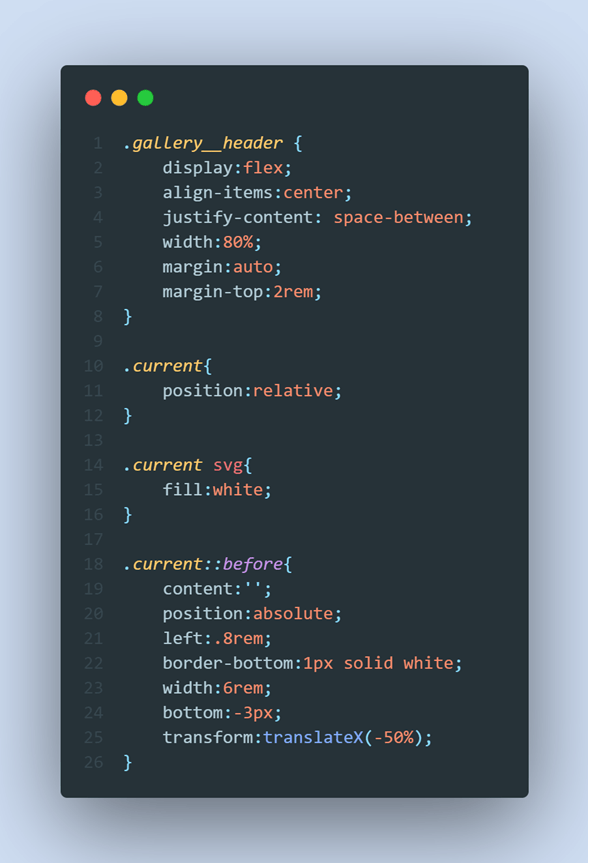
and the result will be
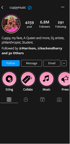
Next will be the gallery itself containing the photos. In designing this , we'll have to pick a property that will help us manage this div and it's structure. Observing the structure we can see that each of the photos take up a certain width and height and all of them are contained in a div which we allow to overflow to the next row if full, and full in this case will be for each row to contain at most 3 photos. So to help arrange these dynamically cause at some point (real world case), we wont expect a row to always contain 3 photos, some might be with 2 or just 1. So this means we'll be managing both the horizontal and vertical structure, unlike the use of "flexbox" that helps manages one of those two perfectly fine, we have another nice property called the "grid" and this is what we'll be using for this.
The html will be
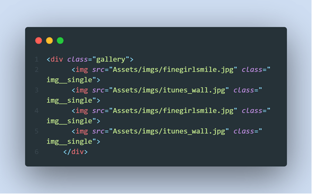
and the css
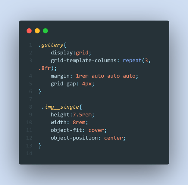
we are not making things complex with grid, we use the "grid-template-columns" to repeat each of the images in a row, by giving the row 3 columns, and each partition of that column should be .8fr of size (we can use rem, em, px, %, e.t.c). My reason of reducing this as default is 1fr, is to manage a little bit of gap in the div.
The result
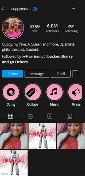
And for the final part which will be left for you to design will be the nav bar, some tips…
You make the position absolute in respect to the body div, It is always best while designing, you arrange them according to the position you are giving it. That is, you’ll have
- body (position relative)
- nav bar (position: absolute)
And maybe give it some margin top to add some gap with the nav and body contents (that's if you want that) and also from the “position” property, use the bottom:0 to stick it to the bottom of the body.
Cant wait to see your designs, and also note, I’m a backend developer tho i did practice little of frontend when I started my coding journey, so if you observe some codes and explanations are wrong, please leave a comment lets all learn, for now, happy hacking!.
and p.s if you have any messages you can send a dm at twitter, username is "backendharry". same with linkedIn too
